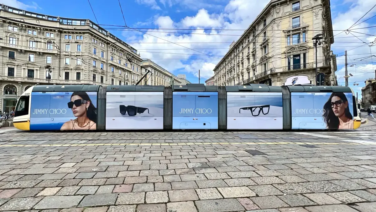
Jimmy Choo Eyewear's Global OOH Campaign Across Fashion Capitals
Sally Langford
Oct 5, 2026

By Khuzaima YammanNov 6, 20264 min read
A successful billboard ad should communicate its message within seconds. Whether placed beside a busy motorway, in a city centre or at a major transport hub, the design needs to be clear enough for people to understand while moving.
Billboards have limited space to communicate with audiences. Drivers may see an advertisement for only a few seconds, while pedestrians have more time to take in the details. This makes the choice of words, images, colours and layout particularly important.
Understanding how to design a billboard ad starts with three questions: Who will see it? What should they remember? What action should they take?
The following ten tips explain how to create effective billboard designs for different locations, audiences and campaign objectives.
Every billboard needs a central message that people can understand quickly.
Before developing the creative, decide what the campaign should communicate. This could be a new product, an upcoming event, a promotional offer or a brand announcement.
Trying to include several messages can make the design difficult to follow.
For example, a property developer launching a new residential project could focus on the development name, location and one distinctive feature.
The supporting details can appear on the company's website or landing page.
Design tip: Write the main message in one sentence before choosing the visuals. If it takes several sentences to explain, simplify it.
Typography has a direct impact on billboard visibility.
Simple, bold fonts generally work well because their letter shapes remain recognisable from a distance.
When selecting typography, consider:
Test the design at a reduced size to see whether the headline remains readable.
For international campaigns, check how the chosen typeface handles different languages and writing systems.
A well-chosen image can communicate a product, experience or idea almost immediately.
The strongest billboard visuals usually have a clear subject and limited background distractions.
A luxury watch campaign might feature a close-up product photograph. A tourism campaign could use a recognisable destination, while a food brand might highlight its main product.
For effective outdoor advertising, the image should remain recognisable at the actual viewing distance.
Avoid placing important details near the edges of the design, particularly when the billboard structure may affect visibility.
Colour helps determine whether a billboard stands out against its surroundings.
High contrast between the text and background makes the message easier to read.
Dark lettering on a light background or light lettering on a dark background can both work well.
The surrounding environment also matters. A billboard installed against a bright urban skyline may require a different colour treatment from one positioned beside a tree-lined road.
Brand colours should remain consistent, but designers can adjust the layout and supporting shades to improve readability.
A billboard's location influences how the creative should be developed.
Roadside placements, shopping districts, airports and pedestrian areas offer different viewing conditions.
For example:
A campaign running across several countries may require different creative versions to reflect local languages, cultural preferences and advertising regulations.
Location planning should therefore begin before the final design is approved.
A call to action tells the audience what to do after seeing the advertisement.
The most suitable action depends on the campaign objective.
Examples include:
For billboard advertising, the call to action should be short and easy to remember.
QR codes may be suitable for pedestrian environments where people can safely stop and scan them. They are generally unsuitable as the main response mechanism for drivers.
A memorable website address or recognisable brand name may be more practical for roadside campaigns.
告诉我们目标市场、受众与目标。我们的专家团队将制定方案,并负责从简报到交付的全程执行与管理。
告诉我们目标市场、受众与目标。我们的专家将在48小时内回复推荐的广告形式、可用资源及后续步骤。
分享您的简报,专家将在48小时内回复推荐的广告形式、可用资源及后续步骤。